PROS
- Attractive, responsive-design themes
- Full commerce options, including the ability to sell digital goods
- Site stats included
- Lets you switch themes without rebuilding your site
- Unlimited data transfers with all plans
- Excellent uptime
- Free tier
CONS
- Limited theme customization
- Lacks reusable photo storage
- No interface-wide undo feature
- Slow-responding customer services in testing
In the world of online website builders, Weebly from Square—not to be confused with Squarespace—remains a solid contender. The site-creation tool impresses with a clear, simple interface that lets you easily build excellent-looking, responsive webpages. In addition, Weebly’s many, attractive template designs and integrated e-commerce tools offer good site-creation flexibility, especially for mobile sites. Unfortunately, Square lacks a universal undo button or the ability for you to reuse uploaded images, and has limited theme customization.
Weebly’s Free and Paid Plans
You can start building your Weebly site for the low, low price of your email address and password. That’s right, Weebly has a free tier, unlike Squarespace. Naturally, the free option comes with a few limitations. Your site will have just 500MB of storage, a Weebly-based domain name, Square ads, and a 10MB maximum file size. On the upside, all Weebly plans come with unlimited monthly data transfers.
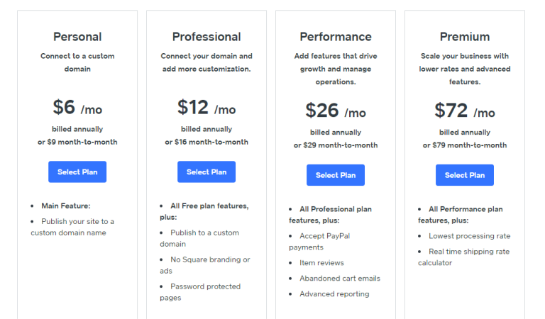
For $9 per month, the Personal account removes the Weebly branding and lets you connect a custom domain name, sell digital goods, and leverage a shipping calculator. At $16 per month, the Professional account adds unlimited storage, a free domain name, site search, password protection for up to 100 site members, and improved site stats. With a $29-per-month Performance account, you can sell unlimited products, receive payments through PayPal, let users leave item reviews, print shipping labels, and access priority support. If you’re looking to sell products, Weebly’s performance tier is the way to go. Finally, for $79 per month, the Premium tier includes additional business features like real-time shipping and lowers processing rates to help businesses scale.
The first choice you make when you start building with Weebly is whether you want to sell on your site. Once you’ve made that choice, you choose a template. There’s no questionnaire to help you narrow down the options or a system of tags to search through, like Squarespace. Instead, Weebly has a few categories, such as Blog, Business, or Portfolio. With only about 50 choices, Weebly doesn’t offer as many site themes Squarespace or Editors’ Choice pick Wix.
Web Design Tools
Weebly’s editor is clear and easy to read, with a grey top bar for managing pages and changing settings, such as your site’s name or category. The editor’s left side houses a dark grey bar with site elements; you drag and drop elements from this panel onto your site in the edit window. The panel switches function modes when you make choices—Build, Pages, Theme, Store, Apps, Settings, and Help—from a menu across the top. A large orange button tempts you to upgrade from a free account to a paid account, and a blue one publishes the site you’re building.
You can add all the usual elements to your site’s page, including text boxes, images, maps, spacers, and media. The latter consists of video, audio, and document files, but only the Professional, Performance, and Premium tiers can insert audio and HD video. There are also elements for feeds, forums, polls, RSVP forms, and surveys. If what you’re looking for isn’t available, you may find it in the Apps section—more on this below.
As with Squarespace (but unlike Wix), Weebly doesn’t exactly let you just drag items anywhere you like on the page. In testing, the object we tried dragging to a spot often flew somewhere else on the page vaguely where we wanted it. When you move the mouse cursor to the right away from the toolbar, it hides to show more of the site you’re designing. Premium objects’ buttons have an orange lightning icon on them, and if you drag one onto your page, you get a message asking you to upgrade.
The Section element offers a way to add a content area into which you can drop more objects. A Section can be a free-form rectangle or it can use one of five layout types: Gallery, Contact, Menu, Featured, and Team. Team is the typical staff profile page you see on corporate sites, and the others are self-explanatory. You can drag the top or bottom of a Section up or down to resize it—something you surprisingly cannot do with a lot of elements, though you can use the Space element to resize areas.
The theme customization options are limited. You can change the text is certain sections—you can customize any text type’s font, color, spacing, and size—and generally choose between some limited color options. Most site builders, including Squarespace, let you customize the web design template’s color palette, too. The flip side of these limitations is you can change theme at any time without having to rebuild the site from scratch.
Page Management
You can add site pages from the sidebar that appears when you choose Pages from the top menu bar. We like this because it doesn’t boot you from your site’s preview page. It offers a choice of a standard page, blog page, store page, or external page. We also like the way clicking navigation elements in the Weebly builder takes you to the target destination. Wix makes you navigate via the sidebar. On the other hand, Wix also lets you do some cool things that aren’t built into Weebly, such as animating your title text and using image-carousel backgrounds.
Unfortunately, Weebly lacks an Undo feature for site changes, such as adding elements or changing the theme, let alone a full history feature like that in Wix, which lets you roll back your entire site to a previous state. However, Weebly offers Undo and Redo buttons for simple text entry, however. With Wix, you can hit Ctrl-Z to undo a box resizing, for example, and both it and Duda have permanent undo and redo buttons for everything you do in the builder.
We like how Weebly (like Wix) lets you enter text directly on the page rather than in a sidebar, something that Squarespace and a few others still make you do. But Wix also goes one better by offering right-click context menu options for replacing images and editing text. Wix even offers animation of your site objects!
Apps and Images
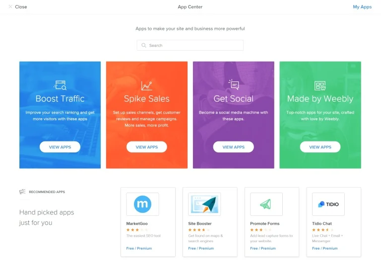
From the toolbar’s Apps button, you can head to the App Center, where there’s an array of more than 350 widgets to add to your site—some free, some with fees. These extend your site’s capabilities, similar to WordPress plug-ins. When adding a FAQ app to our Weebly site, we just had to grant it access to our Weebly account, which is similar to authorizing a web app with Facebook. Once added, your apps show up under Installed Apps. Like WordPress, the quality of the apps are variable; some we tried had tutorials, while others did not.
Other available apps include Facebook Chat, Printful, and Privy, with categories for eCommerce, Marketing, or Social apps. In terms of sheer numbers, Weebly has a respectable widget selection, rivaling Wix. However, Wix’s apps are better integrated and easier to navigate.
Perhaps one of Weebly’s biggest drawbacks is that it doesn’t provide online storage for your site images and videos so that you can reuse them. Instead, you must store the images locally, and re-upload them every time you want to use them somewhere else. Backgrounds, which appear on multiple pages, are an exception. Wix, Duda, and Squarespace offer an online repository for all your images.
Weebly has fine image-editing shops. You can adjust brightness, contrast, and color saturation, or apply over two dozen adjustable Instagram-style filters. You also have the ability to add text, as well as a linear or circular focus effect. One quibble with the last tool is that it’s only a circle, making it hard to fit to a face. Squarespace and Wix offer a fuller set of photo editing capabilities, with the integrated Aviary online image editing tools.
You can upload multiple images at a time with Weebly’s attractive gallery widget. It’s also easy to assign an internal or external link to an image. Wix lets you access your photos from other online sources, such as Flickr and Facebook, as well as offering stock photography (as Squarespace also does). Weebly’s image search lets you find images on Flickr, leaving you to determine licensing and attribution for those images. You can set these as favorites, though you can’t do that for your own uploaded images.
Blogging and Publishing
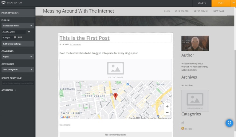
Weebly’s blogging interface is as straightforward as the rest of its site builder, with a New Post button appearing on the bottom of any page of the Blog type. You can drag any element from the sidebar into your blog post, but Weebly is a bit tedious here. There are no standard blog templates, so you have to drag any text, images, or galleries every time you want to use them. You can control social sharing and commenting, however, and comments are threaded and can be easily deleted.
Weebly lets you add tags to your posts, and you can save them as drafts before publishing. You can set posts to be announced on your Facebook and Twitter feeds automatically, too. Wix offers a few more blog-related widgets like tag clouds and feature posts, but Weebly does a good job of presenting the archive and categories list, as well as offering Flickr and LinkedIn badges. Both services automatically produce RSS feeds for your blogs.
A Publish button takes your Weebly site live. There’s no need for a Save button, since edits are saved automatically. This contrasts with Wix, which requires you to explicitly hit save any time you want site edits to stick. Which you prefer depends on your work style. Thankfully, Weebly contrasts with some site builders, such as 1&1 MyWebsite, that publish whenever you edit, giving you no chance to change your mind. Another plus here for Weebly is that, as with Wix, you can have multiple editors working on a site. To set it up, you just send an email and specify whether your coeditor should have full Admin, Author, or Dashboard-only rights.
Making Money With Your Site
Weebly lets paid account holders add Store and Product page types with a rich set of commerce tools. You can even import products from Etsy, Shopify, or a CSV file. You can accept payments using Square and Stripe, as well as PayPal starting from Performance tier. The builder includes inventory tracking and abandoned cart notifications, the latter of which requires a top-level Performance account. Weebly—unlike Simvoly, Squarespace, and Wix—charges a 2.9 percent transaction fee (plus $0.30 per transaction) on top of what the payment processor charges.
The Store builder has all the elements you expect, including a shopping cart, sale prices, invoices, coupons, sizes, and colors. The page editor includes ecommerce elements. Like Squarespace, Weebly lets you sell digital downloads, but this requires a Personal account. Weebly lets you bulk-edit and delete products and to redesign categories. It also lets your shoppers write reviews about your products.
You can paste AdSense ads on your Weebly pages, for an additional (albeit usually meager) stream of revenue. An easy-to-use integrated setup feature lets you authorize Weebly for your AdSense account (or even create a new one).
Weebly includes an integrated newsletter email feature for paid account levels, called Promote, and an element in which site visitors can subscribe. When a user signs up, Weebly sends an email to your admin email notifying you of the new subscriber. The email marketing tool is easy to use and offers a flexible way to get the word out, even suggesting mail blasts when you have a product on sale.
Mobile Site Design and App
Weebly has mobile site-creation strategy similar to Squarespace’s. It automatically generates a good-looking, responsive mobile site based on your site template. Like Duda and Wix, Weebly offers a button that takes you to mobile site editing. Weebly’s responsive designs do look great on mobile phones, and can even fill the whole background with an image, but all this comes at the cost of customizability.
Weebly is ahead of most of the pack in delivering touch-friendly, drag-and-drop supporting Android and iOS apps for site building. Weebly’s app even offers an associated Apple Watch app that alerts you about site traffic or commerce transactions. Jimdo has an app, too, but it’s limited in the number of page elements it can add. The Wix app lets you edit ecommerce features and blog with it, but it doesn’t offer site creation and design edits like Weebly’s does. In any case, editing a site design on the iPad isn’t ideal. For example, iOS has its own ideas about what should happen when you long-press on an image, making it hard to perform some edits.
Site Statistics and Mobility
Even free users get access to some site-activity stats for their Weebly sites—not the case with Wix or Virb. Free users can see page views and unique visitors for each day of the month, but upgraded accounts, starting from the Professional tier, can see search terms used to get to the site, referring sites, and top-visited pages.
A big advantage of Weebly, and one that differentiates it from nearly all other online site builders, is that you can take a site built in Weebly elsewhere for hosting. From the editor’s Settings page, Weebly lets you download your site as a ZIP archive file with all of your HTML and send it via email. This means you can move the site to a standard web hosting service. This doesn’t include some of the interactive features like your storefront and comments, but even this much is not possible with Squarespace or Wix. This capability is a serious differentiator, and it’s worth considering if you don’t want your site to be locked into one service.
Ho-Hum Customer Service
Weebly offers a full knowledge base with hundreds of articles to help you out, but if you need more, the service also has 24/7 online chat and email support. By default, you’re routed to an online bot that’ll do its best to forward you towards a specific article. The Customer Success Team is available everyday via email or chat from 9 a.m. to 9 p.m. EDT. Unfortunately, it took 30 minutes for a representative to respond to our query. By then, we were actually working in another tab and missed the response. We understand why they want you to use the bot.
Weebly Is Worth Considering
Apart from its lack of sitewide undo functionality and photo storage, Weebly remains one of the easiest site builders to use. It offers a number of free options, and is one of very few such services we’ve reviewed that let you export standard site code. The responsive designs look great, but they limit design customizability. Our Editors’ Choice website builders Duda and Wix edge it out, however, because they are more intuitive and full-featured.
For more on getting started online, read our tips on how to create a website. You might also want to check out our story on how to register a domain name for your website. Our SEO tips will help your page rank well in search engines, too.


0 Comments